Coreldraw graphics suite 2019 for macos
Dare to design differently.
CorelDRAW Graphics Suite 2019 is the biggest launch to date for Corel; re-introducing CorelDRAW back to the Mac after 20 years. The Ottawa R-D team was tasked with leading the redesign of the entire graphic suite with the ultimate goal of creating a native macOS experience within the applications to make current Apple users feel at home if they were making the switch from Windows or for those who are just trying the product out for the first time.
The Problem
How do we translate a windows application to the mac os while providing an authentic experience to the mac user?
The Team
I worked with six other UX designers. I lead the projects of translating Installation/Setup, Learning Materials and Palettes to the mac platform. Development and QA were located both in-house and remote.
Timeline
A 2-year project with shorter timelines within this time frame per feature with different scrum teams.
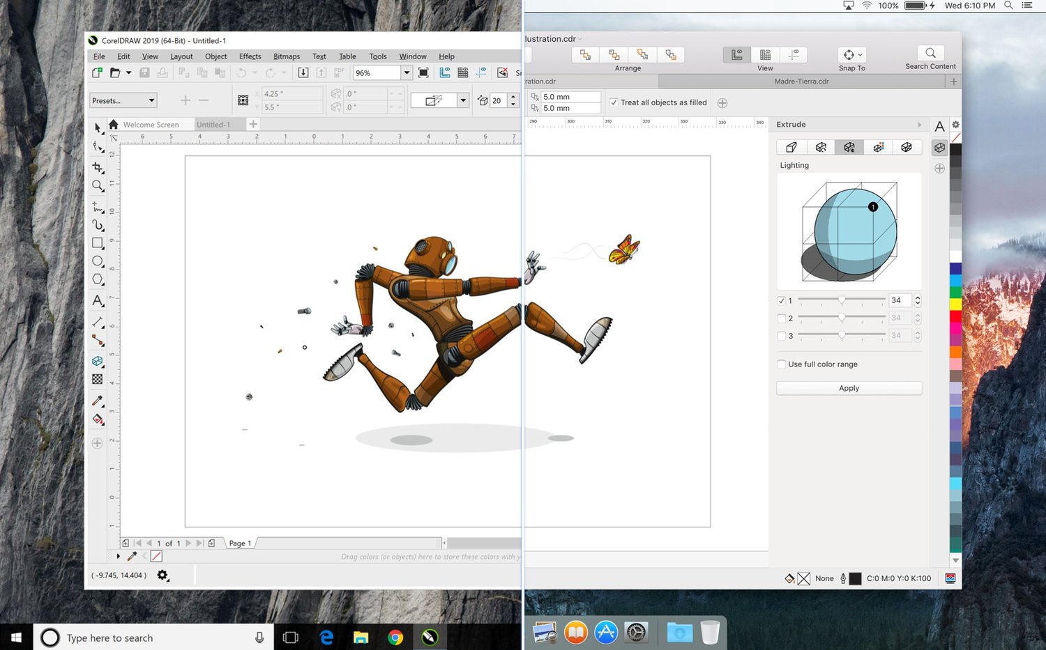
CorelDRAW Graphics Suite on macOS
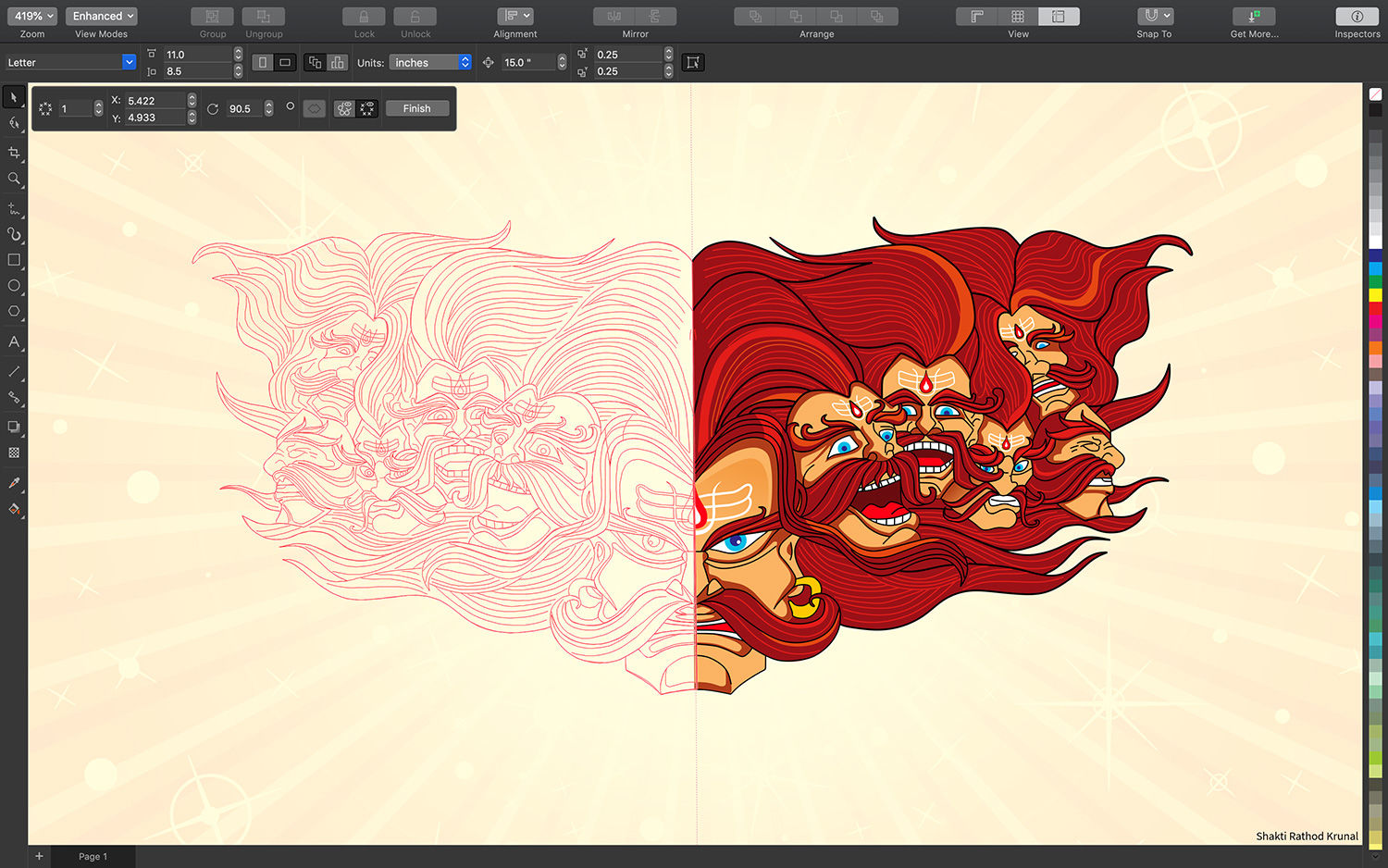
Symmetry Mode in a Dark Workspace in CorelDRAW
Who is the apple User?
Corel has a longstanding history with Window users, but the challenge was to find the mac user and to provide them with an authentic Mac experience within CorelDRAW. A big challenge in doing the user research and feedback was the secrecy that was enforced by management. This limited the users we interacted with so we relied heavily on special contractors and an internal set of users to conduct research.
Early on in the project, the team immersed themselves into the apple ecosystem to learn the nuances of the operating system.
Moving towards 2020, we now have a group of users we can interact with for research and feedback purposes since the release of 2019.
Installation & Setup for macos
Translating Window’s setup and installation screens for the macOS platform.
Installation and setup workflow map
The CDGS setup accounts for different types of user accounts, making the workflow quite complex, this is a simplified map of the whole process.
Installer Screen Evolution from Windows to Mac
Window’s Installer Screen shown on the far left, and the transition of information into a new layout for MacOS (from left to right).
Registration Screen Layout
Layout and dimensions used in the layout above, were taken from the design guidelines that were created internally between the UX team specifically for CDGS macOS.
Trial Screens Exploration
A landscape layout is more traditional for mac, but the portrait style was previously used for Windows. Exploration of both orientations were created.
Key Items
Workflow
An in-depth breakdown of each step of the workflow from initial download to completed registration to first launch was detailed out in a workflow map to ensure that all necessary items were designed for the macOS Installer of CorelDRAW Graphics Suite. Many different scenarios had to be considered to provide the correct experience to users when downloading from different locations or accounts.
Moving Parts
This project required a lot of interdisciplinary team-work between Documentation, Localization, Setup, Development, Legal, IPM, Ecomm, UX and QA. As the main User Experience Designer on the project, I was in charge of balancing the asks of each team in the designs of Installation and Setup. Different teams had certain screens that had special functionality to their area of expertise that needed to be shown to the user and accomodated in each design.
macOS Design Language
Leveraging existing installation and setup components allowed us to provide the user with a native experience. For the registration screens (which were not using native components), inspiration from the setup dialogs were used to provide a seamless flow from setup to registration. During the design of the registration screens, it was important to balance the technical limitations of maintaining two different OS platforms, providing appropriate experiences on each OS, and to be considerate of future maintenance support.
Apple Help for MacOS
Translating Help onto the macOS platform.
Restructuring exercise of Home page topics
Key Items
Content Structuring
CorelDRAW Graphics Suite offers professional programs with a lot of advanced features that are all documented in the Help. The expansive amount of information had not been restructured in many years. With this project, we were able to restructure the Table of Contents to offer easier information navigation to the user. We were also able to revamp the dashboard of the Welcome Page for Help.
Apple Help
To achieve the goal of a native macOS product, we wanted to use as many components of the existing and familiar aspects of the mac in our product. It was required that we implement our help through the Apple Help Viewer. There were technical limitations that were encountered which required implementation help from Apple on a known bug that was present already in the OS.
Hints Inspector Panel
Translating the Hints Docker into the Hints Inspector Panel.
Key Items
macOS Design Language
Because the whole application was being built into a native mac experience, it was only fitting that the Hints Docker which was becoming the Hints Inspector to have the appropriate macOS Design Language. The Hints Panel is an HTML box that was designed with CSS styling to achieve a mac-like feel.
Fresh Content
In addition to the new look; new icons and help images were created to support the overall experience of the application. Over 400 images were created from scratch to depict the help documentation.
“It’s good to see CorelDraw Graphics Suite back on the Mac. The main CorelDraw app is a genuinely attractive tool for professional-level vector graphics and illustration work, and Photo-Paint is a welcome bonus.”


