Color Harmonies for Painter 2020
The Color Harmonies feature can be seen at 3:20.
Color Harmonies
Color harmonies are used by artists all over the world to help select pleasing colors to the eye. It is highly valued in creating color combinations that help achieve certain moods and aesthetics. This was a new feature created and implemented for the artists of Painter, to facilitate with selecting colors with the existing Color Selection tools. Lean development methodologies allowed the project to have a large beneficial impact with low cost while ensuring simplicity for existing and new users.
The Problem
How can we provide useful Color Harmonies to our Artists to help facilitate and inspire their palettes?
The Team
I was the main User Experience Designer on this project, reporting to the Principal Designer of Painter. Development was both local and remote, with onsite QA.
Timeline
5 weeks
Rough pre-planning sketches from an ideation session.
Palette analysis on different artworks; shown artwork is by Karen Bonaker.
Understanding the User
There are two main types of artists that we conducted research on: traditional artist with a painterly style (think oil paintings and thick paint), and illustrative artists who do concept art. Both personas have very different approaches to building their palettes but harmonies can effectively be used by both. Certain harmonies such as Analogous, were highly requested by the traditional artist, where as the more punchy and contrast heavy harmonies were often selected by the illustrative types. Both agreed that it would be something fun and useful to add to their Painter feature set.
Discovery Phase
Color Theory
Took a deep dive into the world of Color Theory to fully understand the impacts of different harmonies in different color spaces. Each harmony evokes different feelings when used in artwork, and with a large overall user base, I wanted to be able to offer harmonies everyone could benefit from and use in their workflows.
Painter Workflows
Being my first time working on a full feature for Painter, there was a lot of quick learning about painting and artists workflows. Understanding Painter’s design language and the users who create the amazing artwork was key to providing a solution that would best address their work. I wanted to be able to provide an authentic and seamless experience to existing users and something easy to understand and learn for new users.
Competitive Research
There are many online resources that offer different algorithms for multiple Color Harmonies. Easy and free to use, these resources were already being used by the Painter user base but they existed outside of the Painter application making it difficult for users to save Harmonies and palettes within their painting program. This was a valuable pain-point in which we were able to address in our implementation of a Color Harmonies feature.
A key competitor was Coolorus, named the best color wheel for Photoshop, a lot of our users were familiar with this product and would use it as a comparison for any implementation that was to be developed for Painter. A lot of users liked the idea of having swatch points on the color wheel like in Coolorus but for the limited time we had for this project it was out of scope.
User Feedback
After talking with users… The addition of monochrome harmonies were also provided to the original set of four Color Harmonies
Exploration Phase
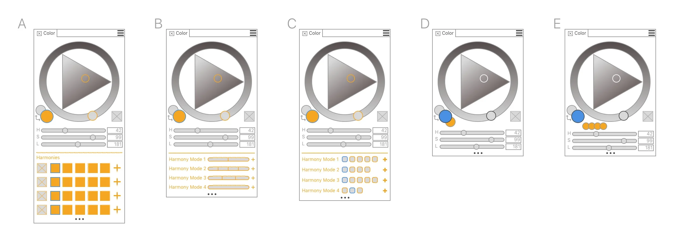
Displaying the Color Harmonies
The Color Harmonies were spec’d to be in the Main Color Panel as it was directly affected by the color selection of the Color Wheel. Different concepts were explored, all using key design language that already existed in Painter.
Multiple Harmonies
The ask was to provide four color harmonies, after user research we ended up including six: Complementary, Analogous, Split Complementary, Tetradic, Monochromatic Light and Monochromatic Dark.
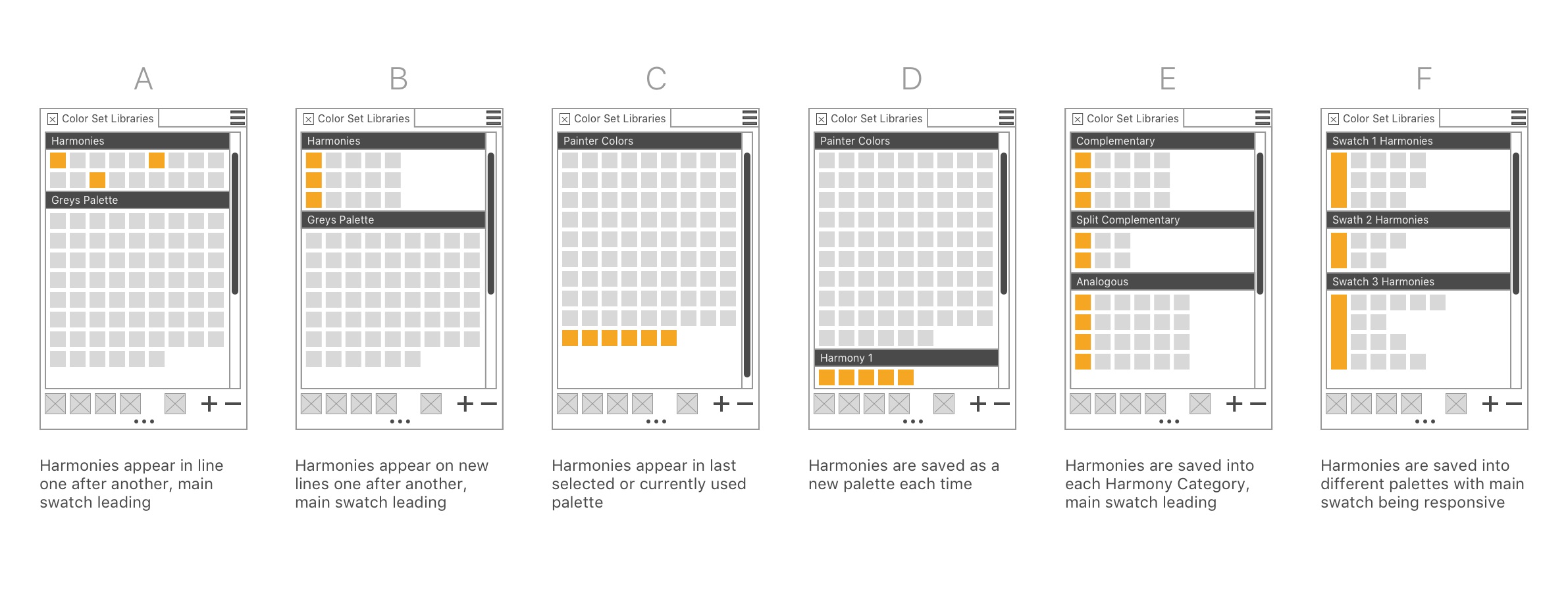
Saving a Color Harmony
A key workflow that provided the most value to our user was being able to save a harmony as a palette. This was of huge value to the user to not have to jump between two programs to build a palette but being able to build a palette from harmony explorations within a single application and to continue to paint.
Design Process
Different options of presenting color harmonies
Workflow: Displaying multiple harmonies
Workflow: Saving harmonies
Displaying Saved Harmonies
Iteration
Harmony workflow rework
After speaking with multiple users, the initial method the Color Harmonies interacted with the Color Wheel proved to be too fluid and wasn’t as impactful as it could have been to the users. Two new workflows that were explored to help bring more value to the feature: linking/unlinking and lock/unlocking harmonies. Both workflows were presented to users for user testing, and the lock/unlocking workflow was chosen for Painter 2020.
Harmonies Panel
Due to other work-space issues within the framework of Painter, the Color Harmonies could no longer be placed within the same panel as the Main Color Wheel. Due to the increase in space to display the harmonies in a separate panel, by default the Complementary Color Harmony Mode would only be visible. The user would have to enable the other Harmony Modes to view, but after turning them visible in their workspace, they would be remembered until the user decides to hide them again, this allows for user to customize the experience to their workflow.
“I think it would be awesome if you could lock the harmonies you get on first click, rather than opening another panel. I don’t find it useful to each time you click you get ones and have to save them on swatches. its like an extra step.”
Workflow: Locking and Unlocking
Final Design
Screenshot of Color Harmonies in Painter 2020 on Mac with artwork by Moonpix Art.
“This is a major help! Sometimes I get lost in how much color I put into my work and can botch it up at a moments notice. The harmony selection is a godsend to those who work in a lot of color and to those still struggling with color theory.””
“Color Harmonies tab - it’s a thing of beauty.”
“I really enjoy the monochromatic harmonies for quick shading.”
The final design is available to play with in Painter 2020.
Though the project is released there is so much more I think that can be done with Color Harmonies that I know will make our users very happy, but for a first introduction of the feature I believe it addressed many of our users needs and wants and it is actively helping them discover and expand their color selections!


